
The Federal Election Commission (FEC) is a federal agency that regulates how candidates and political groups raise and spend money in United States federal elections.
The FEC has published campaign finance data for decades — we liked to say they were doing open data before it was cool — but their legacy website was dense and hard to use. They wanted to make it easier for journalists, transparency groups, and members of the public to use their data and learn how money flows through federal campaigns.
Part of modernizing the digital experience was evaluating and updating the look and feel of their main agency website, which hadn’t been touched in over a decade.

The original website: cluttered, not user-informed, and not responsive.
Discovery and research
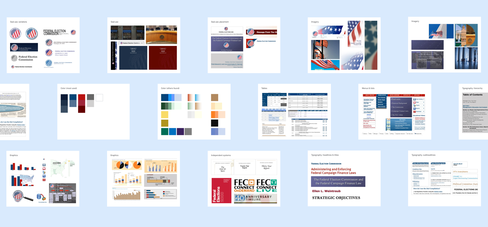
The FEC didn't have a set of shared styles, brand guidance, or any team members who considered themselves to be designers by trade. Their existing look and feel was a collage made by many individuals, using what systems and tools they each knew best, and by roughly approximating the last styles they'd seen with what they thought looked right.
I conducted a visual audit of everything in use I could find in their offices and online. The audit, and the discussion that followed showed us a few things:
- Color was a particularly tricky needle to thread for them — they wanted to find something that spoke to the political and governmental nature of their work, but avoided partisan associations. We heard, “The only color we could agree on was gray.”
- Imagery had also been challenging. They felt stuck around government buildings, or images of flags. These were traditional but vague government themes.
- Making changes to the website involved a fresh, complex round of approvals every time that revisited old decisions around look and feel based on individual opinions. Getting buy-in was going to be very important to building a system that would stick, but would relieve the team from making these decisions every time they needed to make a content change.
After discussing the audit results, the team created an outline of what we wanted to accomplish:
Goals
The FEC’s visual identity system should…
- work for web, print, and environmental design use.
- be able to be built upon for future needs.
- have ready-to-use or easy-to-build style patterns that make the default design the best design.
- act as a foundation for all of the FEC’s visual design decisions.
- encourage information to be visually presented.
- help viewers understand what the FEC does.
Prototyping and iteration
Creating a new system: moodboards
Informed by the audit and our goals, we used several rounds of moodboard design to narrow in on an updated look and feel. I worked with our team's content strategist to include examples of tone and voice that reinforced the direction we were pursuing.


Voice and tone by Emileigh Barnes
Defining the new system
Managing the mark
One of the first things we did was define a limited set of compositions for the official federal seal and a more flexible wordmark. I learned that changing an agency's logo or seal takes an act of Congress and was definitively out of scope for what we were trying to achieve.


Making color usable and useful
In order to avoid partisal connotations of red and blue, but keep them strong players in the palette, we created color pairing rules for each primary color and its accent. Then, we put them to work as wayfinding mechanisms, and assigned alternating colors to each of the primary navigation sections.

Using color in the site wayfinding

The color pairing system
Standardizing visual templates
We made simple, predictable, and extendable, visual templates for icons and thumbnail images across the site that stuck to the color pairing rules, and fit with existing assets that users knew and looked for.
Extendable visual templates for icons and thumbnail images
Building for the future
A living, shareable style guide
To make the new style system visible to anyone at the FEC, we built a pattern library that collected the styles and components. Here we documented design rationale, instruction s on when to use specific components (or when to consider something else) and any relevant guidance for design and code on the component from the US Web Design System.
The FEC pattern library is built using Fractal, and powered by real code in use on the live site.

Two components from the pattern library

Style documentation for iconography and the grid

Iterations of the live beta site home page