
18F partnered with the Centers for Medicare & Medicaid Services (CMS) to develop an web app that helps states apply for federal funding, and helps CMS analysts review those applications more efficiently.
The Advanced Planning Document (APD) is the primary vehicle for states to request Federal funding and is used across many different agencies within the Federal government. An APD provides insight into who, what, when, where, how and how much the state needs to accomplish their Medicare and Medicaid program goals.
A decision from CMS generally occurs through a cyclical process:
State submits a request
CMS reviews the request and decides to approve or not
CMS responds to the state with their decision
UX challenges
The submission and review process was entirely paper and email-based.
Despite voluminous guidance, each state submitted applications that varied in structure and content from one another greatly. This made it harder for analysts to review.
The length of the applications and supporting documents made it difficult for states and CMS analysts to discuss specific pieces of their program with certainty.
Once an application was submitted there was a “black box of uncertainty” to what happened next.
My role
I was part of a distributed team of designers, product managers, and engineers working with product owners at CMS to build a minimally viable prototype that a small number of states could use to submit their APDs electronically. When I joined the project, a rough proof of concept prototype existed that focused on ideal functionality. My job was to bring this prototype closer to reality by refining the design strategy to get us to a releasable product, working with engineers to build the prototype with the CMS design system, and help CMS understand their real users’ needs.

Visual strategy: Finding a baseline look & feel
Although the CMS Design System existed, every product that used it to date had been considered it’s own sub-brand (like Healthcare.gov) , and each used a customized look and feel specific to that product. So while the style components existed, there wasn’t much canon to pull from in terms of layouts, interactions, or patterns. The eAPD builder was the first CMS product to use the CMS Design System in a pure expression of their styles, so we got the chance to set the baseline and show CMS what the most straightforward application of their system looked like. I paired with engineers to implement the structural code of the CMS design system into our app’s environment.
Additionally, we were able to contribute back to the design system and make it more usable for other product teams.


Creating hierarchy in the layout
The existing proof-of-concept prototype used one layout for the entire experience, In usability testing, we observed users struggling to recognize when they’d navigated to a new page. In response, I introduced new layouts for unique actions, like managing accounts, selecting the document to work on, and editing the document.

I also separated the “dashboard” concept from the navigation, which hogged a bunch of screen real estate for a redundant left-hand navigation. It previously reserved more space than needed for the APD lists: users would only have one or two active APDs at a time, so a more visual centered list kept the focus more precise.

I also introduced a numbering system within the form itself to help users and analysts reference parts of the (extremely long) process with more certainty.

BEFORE: The form navigation didn’t indicate which parts expand to sub-sections, and users fumbled over referencing the long titles.
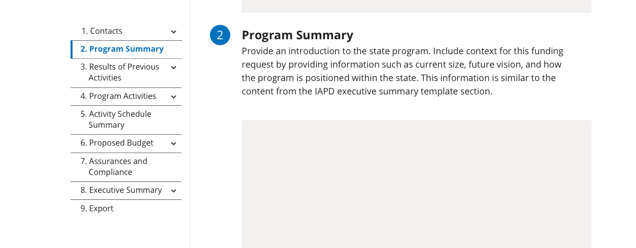
AFTER: The form navigation reveals more hierarchy and users could quickly reference parts of the form by their section number.
Streamlining interactions
The proof-of-concept prototype had the basic idea of the necessary requirements, but the interactions were built without knowledge of best practices. I redesigned many small interaction flows that made the details easier and more intuitive for users. In several instances this included changing the format of individual elements, like buttons, inputs and selects to use one more appropriate to the task. In others, it was designing a different interaction flow or pattern altogether that lowered users’ cognitive load and could be reused elsewhere in the app.

BEFORE: It was challenging to understand what information was being summarized, and the interactions didn’t act or respond predictably based on data the user entered. Form fields took up entire lines of space no matter what data was expected.

AFTER: I redesigned how the app summarized information into an expanded list format, and used an Add/Edit/Remove interaction for new people and new data. I also shortened the text fields to a more appropriate length for the data. Follow along with our design process in the GitHub issue.