
The Federal Election Commission (FEC) regulates how candidates and political groups raise and spend money in United States federal elections.
The FEC has published campaign finance data for decades — we liked to say they were doing open data before it was cool — but their legacy website was dense and hard to use. They wanted to make it easier for journalists, transparency groups, and members of the public to use their data and learn how money flows through federal campaigns.
The FEC’s digital offerings are massive, including millions of campaign finance records, thousands of legal documents, and over 40,000 pages of content covering everything from campaign activity guidance to press releases from 1998. And on top of that, it’s always changing. So instead of starting the redesign with the site itself, we started with modernizing what powered it: the data.
Strategy
Instead of starting with the website, improving the experience for the FEC’s users started with opening up the FEC’s data archives by building a public API. When I joined the project team, we began using that API to power a new beta site, built in the open at beta.fec.gov. We used this beta site to constantly learn, iterate, and improve, working closely with our agency partners to design, build, and refine new features to meet user needs. We also helped them build a practice of writing about complex topics in plain language.
My role
I was part of a distributed team of designers, strategists, and engineers working with the FEC to build and transition the beta site. Some specific pieces I was responsible for:
- Created wireframes and clickable prototypes for layouts and interactions, using consistent styles and patterns.
- Designed, tested, and refined micro-interactions for everything from filter validation to search results.
- Created storymaps to track user needs against a prioritized backlog of work with product owners.
- Facilitated design studios, workshops, and co-creation sessions to build features in a participatory way.
- Coached the FEC’s product team in agile software development practices and user-centered design.
- Built a living pattern library to help the team keep making consistent visual and interaction design choices.
UX challenges
Navigation
The old FEC.gov presented users with over ten different top-level navigation elements. Each interaction behaved slightly differently, and users struggled with knowling where to look. We reduced the primary navigation down to three main items to reflect the most common areas that users needed when coming to the site. We also prioritized responsive designs for mobile navigation.

Candidate and committee profile pages
We launched beta with a new design and architecture for the candidate and committee profile pages and later redesigned these features after user feedback showed that people needed more granular data and were having a hard time finding what they needed.


Legacy, intermediate, and most recent iterations of the candidate/committee profile pages
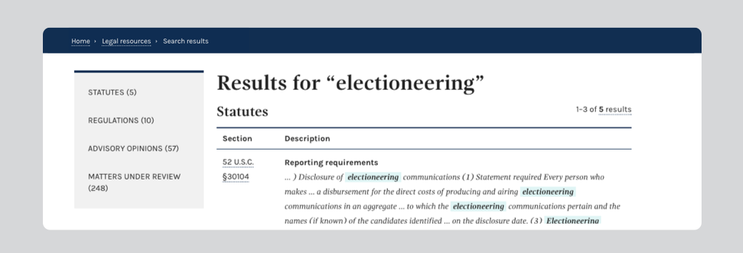
Searching across resources
Previously on the legacy site, the universal search feature was overinclusive and generated an overwhelming amount of search results for users. It also wasn't possible to use the search bar to find candidate or committee profile pages, one fo the results that users needed and wanted most.
Our redesign enabled users to search for candidates, committees, or individual contributors by name or ID through one field, and used sorted typeahead results to point people in the right direction.

The legacy site’s candidate and committee search interaction

The redesigned unified search system
We used search.gov, a free shared government search service, to allow users to search across all content of the site, but presented information in a custom results view that sorts content by type as well as best match. Our results view also made it easier to tell if a page is what you’re looking for before opening it.
Finding and reflecting mental models
The legacy FEC site was organized by how data was structured, which was opaque and unintuitive to users. In order to organize the new site by how users experienced elections, we diagrammed, tested, and made many iterations of the information architecture. We found that users thought about election data in terms of increasing or decreasing geography.
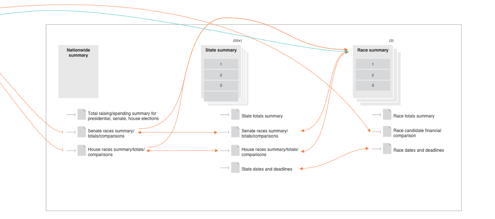
Sketching the information architecture for election summary data
Home page process
The legacy site's home page was extremely brittle and hard to update, which we learned caused a great deal of internal friction about exactly what (or whose) content was featured. As a result, it was infrequently updated.
Our process here focused on separating features from function — helping the FEC identify what types of content was most important to help different users get pointed in the right direction on their journey, instead of specific features like "big images" or "search bars". We structured an exercise across key department stakeholders to collaboratively define principles and trailheads based on extensive user research. We then started blocking off relative space and priority for those pieces.

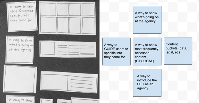
We then used the findings from these exercises to start wireframing different interaction components that accomplished these tasks in different ways. To alleviate the stress of manual updates, we focused on designing for content that would update automatically with the most timely and relevant pieces of information to that time in the campaign finance cycle.

